Adaptive Listening™
Build trust and traction
Uncover a better way to listen that goes beyond active listening and paying attention. Learn about the way you prefer to listen, and adapt to meet the needs of others.


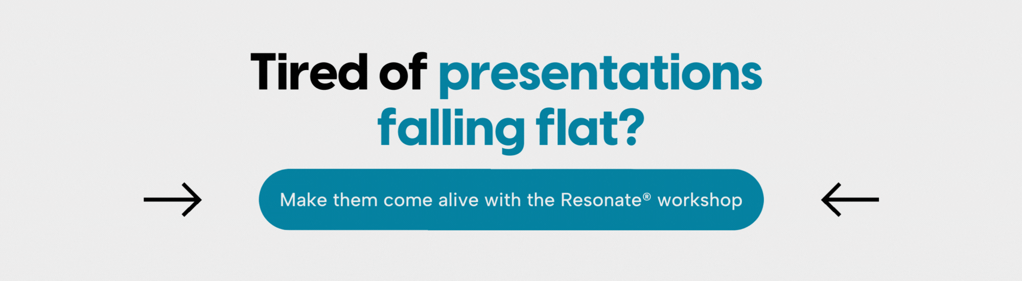
Got a big presentation coming up? If you’ve ever taken Nancy Duarte’s highly-rated workshop Resonate®, you’ll discover that the secret to a standout presentation or speech is creating tension in your content. She coined this as contrast, and officially, the structure to model your presentations is called a Presentation Sparkline™.
Contrast is your secret weapon for an unforgettable presentation. By weaving contrast into your:
You can give presentations that grab attention and resonate deeply with your audience. Depending on your call to action, it can also make your presentation persuasive, getting your audience to do whatever it is you’re hoping they do. Let’s dive into why contrast is so powerful and how to use it effectively.
Contrast is when you create an intentional rhythm in your presentation content. Largely unveiled in Nancy’s TED Talk, she goes into the secret structure that makes the best speeches great, and she identifies it as employing contrast in a speech or presentation.
It can be represented as ebbs and flows, highs and lows, arguments and counterarguments, solutions and problems. In a nutshell, contrast places opposing elements together to highlight their differences, making it a versatile tool beyond aesthetics alone.
Let’s talk about common presentations, and how they often don’t use contrast. You’ve seen these in the corporate world or a timeshare presentation. You’ll learn why they are unsuccessful at moving audiences to action or keeping them engaged.
Every presentation follows a “shape.” Let’s look at a report. Its presentation shape looks something like this:
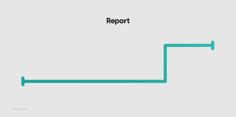
The bottom line represents “what is,” and the top line represents “what could be.” In a typical report, you spend the majority of your time talking about the current status of things. The good, the bad, and the ugly. Then you might suggest a recommendation at the end that could change what the future looks like.
The problem with a report is that it’s boring, and usually, it takes time to “get to the point.” It doesn’t keep your audience engaged, and if you’re presenting to the C-suite, they are annoyed, unengaged, and ready to move on to their next meeting.
Now let’s look at a pitch. It could be a sales pitch or an investor pitch. Its presentation shape looks something like this:
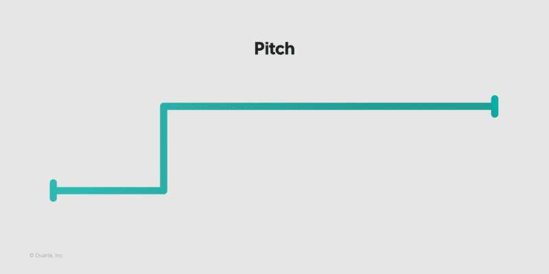
In a typical pitch, you open with the status of things, then spend most of your time talking about how amazing the future will be once you adopt this new idea, product, or service.
The problem with a pitch is that it sounds too good to be true. You spend the whole presentation talking about how your idea is the best thing since sliced bread. Your audience’s guard is up, they’re trying to find the loopholes or the problems (because you didn’t provide any) and they’re trying to figure out “your angle.”
Both types of these common presentations have failed at employing contrast. There’s not enough to keep your audience engaged or to build trust.
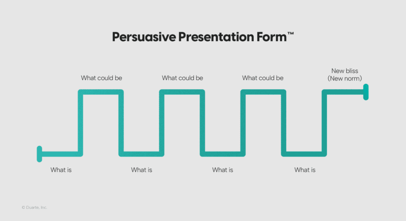
That’s why the best presentations employ contrast, and their shape looks something like this:
Here’s why contrast works:
Our brains are wired to notice differences. In an over-stimulating world, we’re constantly filtering information and determining what’s meaningful and what’s not. Naturally, anything that stands out from — or contrasts — the status quo grabs our attention.
Your presentation is taking your audience on a journey. You’re the storyteller, and your audience is the hero. When used strategically, contrast helps guide your audience through your presentation, clarifying the most important points, emphasizing your message, and making it easier to grasp.
Contrasting content (like addressing challenges and rewards or a personal story illustrating what’s possible despite hardship) can evoke strong emotions, making your presentation more engaging, authentic, and relatable.
Now that you know a bit about why contrast works, let’s cover how it works. Visual contrast is up first.
Visual contrast entails using colors, sizes, shapes, and fonts to make specific elements and pieces of information stand out. Here are some ways to integrate contrast visually into your presentation slides:
Use colors that stand out against each other to highlight key points. Think black-and-white schemes or complementary colors.
Use a distinct color to emphasize critical elements like call-to-action buttons or important data points.
Play with different sizes for text and images to create a visual hierarchy. Larger elements naturally draw the eye in first.
Highlight significant data or quotes by enlarging them compared to other content.
Combine different fonts and styles (like bold and italics) to differentiate headings from body text or to emphasize key phrases/terms.
Disclaimer: While using a few different colors, sizes, and fonts is an effective use of contrast, it’s important to maintain a sense of overall consistency to avoid a chaotic or busy look. Something that you can learn more thoroughly in a slide design workshop like Slide:ology® or Slide Design.
Balance text with impactful images, icons, or graphics. This adds visual interest and makes it easier for the audience to digest (compared to crowded, text-only slides). For example, infographics can help audience members process complex content.
Industry leaders like Apple are no strangers to using contrast in presentations. Apple’s product launches often consist of bold text on clean backgrounds and the strategic use of color to help emphasize their messages.

Example slide from an Apple product presentation displaying contrast.
Many TED Talk speakers also nail visual contrast. The speakers who use simple, clear slides with bold visuals and minimal text keep the focus on their spoken words and create a powerful visual and auditory experience.
Like visual contrast, narrative contrast involves juxtaposing dissimilar elements, but instead of visual elements, these include ideas, emotions, or scenarios. Let’s explore how you can integrate contrast into your presentation content.

Have you ever watched Dreamforce keynotes? (We make their presentation visuals by the way.) They’re great examples of how corporate presenters can infuse narrative contrast. Salesforce speakers always address the current business landscape before conveying how their innovative products and solutions meet the moment, using a mix of customer testimonials, bold visuals, and clear data points to motivate the audience to listen and act.
Narrative contrast comes in many forms. Whatever type you choose, leverage it to build and release tension, ebbing and flowing back and forth between two opposing states.
Now it’s time to cover how contrast impacts your presentation delivery. Here are some tips on how to incorporate vocal contrast to ensure your message is received effectively:
No one wants to listen to a robot: A monotonous voice will lose the audience’s attention. Fluctuating your vocal pitch keeps the audience engaged. Use a higher pitch to convey curiosity or to add some humor. Then use a lower your pitch during more serious moments or declarative statements. This is called vocal variety.
In addition to changing your pitch to emphasize a point, you can also adjust your pace. Slow down to highlight an important point and give the audience time to absorb the information. Increase your pace to convey excitement, urgency, or overwhelm. In other words, use the speed of your speech to convey the emotion you want your audience to feel.
Use varying levels of volume to complement your message. Speaking louder can help you command the room, conveying confidence, authority, and energy. Lowering your volume, on the other hand, can create a sense of intimacy or warmth, drawing the audience in during more reflective or emotional moments. What type of tone (or tones) do you need to set, and when? Once identified, use your voice accordingly.

White space is to slide design as pausing is to presentation delivery: Necessary for breathing room and audience comprehension. Pause after a significant point so the audience has a moment to process. There is no need to fill every second of space with your voice — embrace the pause so your message can sink in.
When I think about skilled speakers, Steve Jobs comes to mind. Jobs was an expert at using vocal contrast. He varied his pitch, tone, and pace to emphasize key points and take the audience on a journey, often using dramatic pauses to build anticipation before revealing new products.
Here are a few final tidbits to keep in mind during your contrast-infusing endeavors.
Before you start thinking about contrast, analyze your audience. Consider their dreams, fears, and objections. Then, you’ll be in the right state of mind to identify the content that they need to hear.
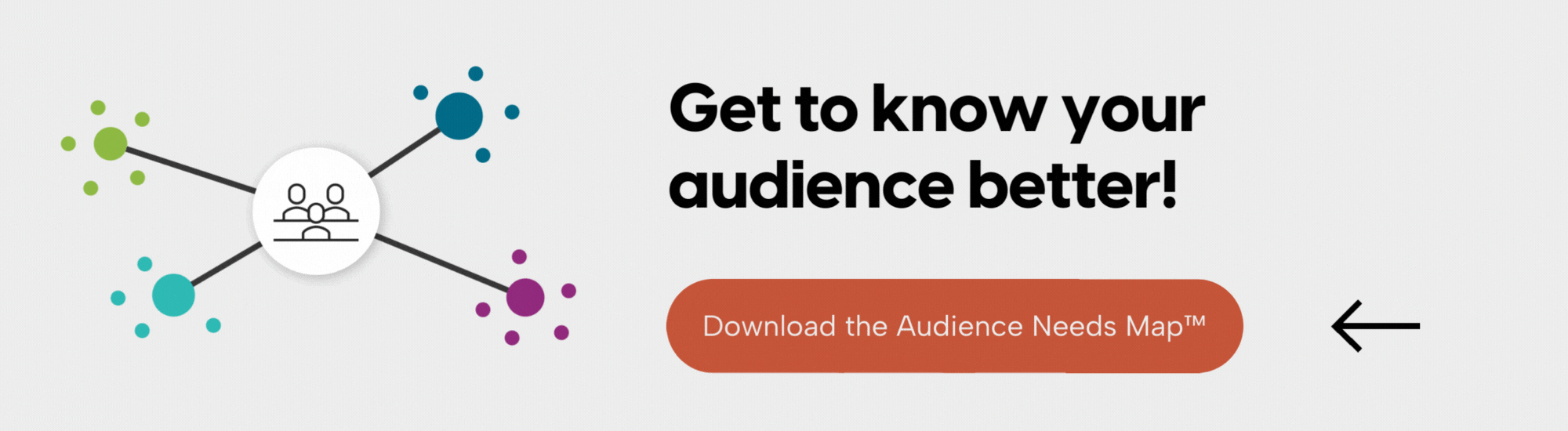
For example, analytical audiences may prefer more data, while emotionally driven audiences may respond better to stories. Although it’s important to strike a balance, it’s also important to lean into what the audience needs most. Download our Audience Needs Map™to help you get started!
Start with a clear understanding of your key messages and build around them. Then, identify all the potential forms of contrast in your story — the problems and solutions, the before’s and after’s, the metrics and the stories. Use the Presentation Sparkline™ structure to fluctuate between what is and what could be throughout your entire presentation to maintain engagement.
Although you may want to introduce high-contrast colors to highlight important elements, use a consistent color scheme and don’t go overboard with the color wheel. Ensure text is legible against backgrounds by choosing colors with sufficient contrast and utilizing a color contrast checker to be safe. It’s always a good idea to brush up on accessibility best practices to ensure you’re using contrast accessibly.
Like any skill, developing public speaking prowess and dynamic stage presence takes practice. Practice varying your pitch, pace, tone, and volume by reading children’s books, newspaper headlines, or using previous presentations. Find the most important word in a sentence and practice verbally punching it. Record yourself and listen back. Do it again. The more you practice, the more awareness you’ll build, and the more naturally vocal contrast will come.
If you really want to nail your delivery, hire a speaker coach or take our public speaking workshop, Captivate™. Both are great resources to get you stage-ready if you have a high-stakes moment coming up!
Incorporating visual, narrative, and vocal contrast into your business presentations can significantly enhance their impact.
Remember, a great presentation is not just about sharing information; it’s about creating an experience that resonates with your audience. With the power of contrast, you can turn even the most complex topic into a captivating story, ensuring your message is not only heard but also remembered.
If you want to learn how to master contrast in your next presentation, train yourself and your team with our Resonate® workshop. You’ll get to work hands-on on a presentation or speech you’d like to deliver and come out with a well-structured presentation full of contrast.