Adaptive Listening™
Build trust and traction
Uncover a better way to listen that goes beyond active listening and paying attention. Learn about the way you prefer to listen, and adapt to meet the needs of others.


We get asked a lot of questions about how to design impactful visuals. So, naturally, we held a webinar to answer some of those questions and offer our top tips and tricks for “designing slides and visual aids that pop”. In case you missed it, I’ve summarized some of the highest-level takeaways that our Senior Director of Strategic Learning, Michael Duarte, and Art Director, Chariti Canny, discussed live. To catch up on all the details (which I highly recommend), the full webinar recording lives here.

First thing’s first: what is a visual aid? By definition, visual aids are visual materials that help people understand and remember information from an oral presentation or lesson.
In other words, visual aids reinforce what we’re hearing and help our brains better process that verbal information.
There’s an entire field devoted to the science behind teaching and learning, predicated on the best practices for presenting information. Psychology Professor at UC Santa Barbara, Richard Mayer, conducted a study about this very topic. He gave two groups of people the same diagram explaining how water cycles work. One group received the diagram accompanied by a narration of the diagram. The other group received the diagram with a transcript of the narrative – but no audio.
The result? The group that saw the diagram and heard the narration did significantly better in follow-up testing. Why? Because our brains can only process so much information before going into cognitive overload mode.
Studies like Mayer’s have found that when communicating an idea you want people to understand and remember, striking a balance between audio and visual is key.
But not all visuals are created equal. Let’s discuss the different types of visual aids and how to use them to your advantage.
We’ve been exposed to visual aids from a young age. Think back to eighth grade math class. It’s unlikely your teacher stood at a podium and relied solely on verbal communication to explain the Pythagorean Theorem. She probably used a chalkboard or whiteboard to draw a right triangle and the a2 + b2 = c2 formula. Am I right? That is a visual aid. Visual aids are regularly used in the classroom because they’re essential to education. And business presentations are a form of education too, which is why getting your visual aids right is so important.
Other visual aids include:
And of course, our favorite (and one of the most commonly used in the business setting): presentation slides. Let’s see how visual aids can be used in action.
Examples of visual aids in presentations come in many different forms. Take a look at a few examples we’ve compiled below.
One great example of a visual aid is a Ted Talk that Bill Gates did. Bill Gates used a prop that really popped during a Ted Talk… See the clip below.
Visual aid example: Minute 5:08, Bill Gates gets the point across on malaria
When Michael Pollan presented on sustainability and food systems, he utilized another powerful and unconventional visual aid (in a way that was a bit less extreme than Gates). To help people understand how much oil is used to make a single fast-food cheeseburger, Pollan placed said cheeseburger next to the amount of oil it took to produce it.
If he had just stood up there and said: “a cheeseburger takes 26 ounces of oil to produce” — the audience may not have really recognized how much oil that was. But by using a visual aid, Michael not only made his message clear — he made it memorable.
Less often than live mosquitoes and vats of oil, we see presentation slides utilized as visual aids. Some common components of those visual aids include:
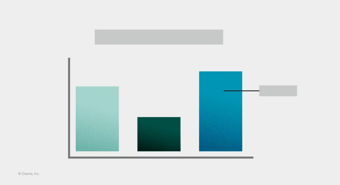
If you’re referencing metrics, forecasts, or statistical trends, it makes sense to show them! But some graphs are clearer than others. Data visualization is an art and a science … and that’s a topic for another course entirely.
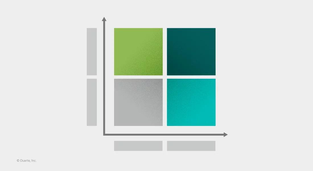
If you’re outlining a process, system, or structure, flowcharts and frameworks are commonly used and widely understood.
Images are one of the most compelling ways to illustrate emotion and capture an audience’s attention. But there are many considerations that must be made first. Where did the image come from? Is it high quality? How will it look on a laptop screen versus a big screen? Will the audience connect with it?
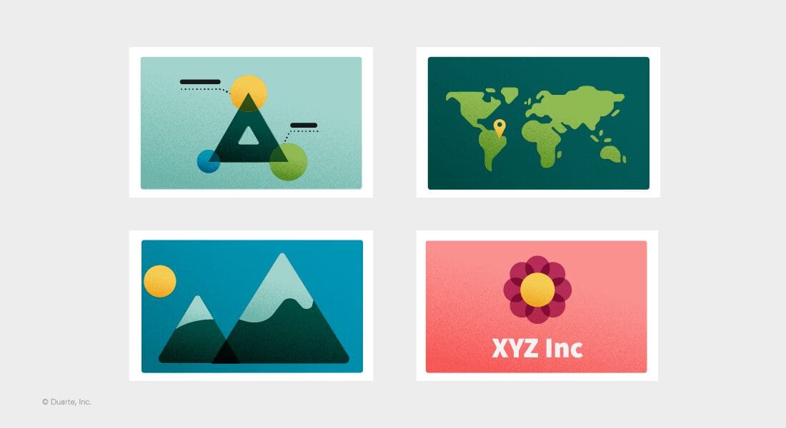
We’re big fans of big quotes and statement slides that well … make a statement! These visuals are a simple way to hit a main point home.
In our 35+ years of presentation development and communications consulting, we’ve found that all of these components can be overdone, and ultimately, do more harm than good. Cluttered collages and overly detailed diagrams will not do your message justice. And that is why we wanted to share our foundational best practices in the first place.
For the sake of everyone, everywhere, who has ever sat through a confusing or dull presentation, we’ve devoted our careers to helping professionals communicate with clarity and influence. And we can’t do that without covering the visual communication basics.
In our webinar, we offered detailed examples of how to put the following three tips into practice. Here’s the CliffsNotes version.
Amplify the signal and reduce the noise. Your main message is your signal – it’s what you want the audience to focus on. To ensure your audience receives the signal, you’ve got to remove any interference. Interference is the noise – in this case, the visual noise. This can include:
Take a look at how much stuff you have on your slide. Is the main message clear? Or is your slide crammed with content? Duarte uses what we call the Glance Test™ to determine if a slide emits a signal or just makes noise. Download it and see it in action for yourself!
Stick to one idea per slide. Tip number two will help you abide by tip number one. When we stick to one idea per slide, we’re much more likely to amplify our signal and clearly convey what we need to say. It can be tempting to display every well-thought-out detail or try to encompass five loosely related messages on one slide. But showing (or speaking to) too much content on one slide overwhelms and disengages your audience. So, it’s up to you to determine what slide content is necessary to support your script and what isn’t.
This editing and refining is one of the most important parts of the slide development process. Ask yourself: “How many messages and details do I have on this slide?” If you realize there’s more than one message, move it to the next slide. And if your slides are crowded with details that don’t directly support or add clarity to your visual, cut them from the slide completely.
That doesn’t mean you can’t speak to the details, but you don’t need everything from your script on your slides. After all, a visual aid supports your spoken content — it doesn’t need to stand on its own.
Itching for an example? See how Michael takes a critical look at simplifying crowded slides in our webinar: Designing slides and visual aids that pop.
Choose the best layout. Once you’ve quieted the visual noise and broken up your slides so that they each focus on one main idea, it’s time to consider layouts. Yes, layouts, plural. You can’t rely on the same layout for every slide. If you do, one slide will blur into the next and the next, and before you know it … you’ve lost your audience. Just like infusing contrast in your narrative keeps the audience engaged, contrasting layouts do too.
Not to mention that different slide layouts illustrate vastly different things. This is where we refer to our main idea and consider what layout will best support it. For example, if you’re introducing a new influencer outreach approach, you may want to use a flowchart to illustrate the process. If you’re breaking down a new organizational initiative, you may want to use a horizontal timeline to display important milestones. And if you’re highlighting a customer success story, a quote slide makes more sense than a chart containing broad customer data.
Want a slide layout starter pack? Look no further than our Slidedocs® templates.
Now that we’ve covered our top three tips for developing visual aids that pop, here are a few final notes to keep in mind.

You would think this goes without saying … but we’ve found that nothing really does. So be sure that your presentation talk track aligns with the visual message being shown on the slide. You’d be surprised how many times I’ve reviewed a presentation only to realize that there is a serious mismatch between the verbal message and the visual one.
Some of the most effective slides are the simplest slides. If it takes your audience more than 10 seconds to understand what they’re looking at, your visual aid is not doing its job. When in doubt, do a Glance Test™. Additionally, slides should be easily comprehensible for all audience members. That means making sure text is large enough, fonts are legible, and colors are accessible. Consider utilizing screen readers, incorporating closed captions, and adding alt text to images for the most accessible presentation possible. There are various accessibility checklists out there and PowerPoint even has a built-in accessibility checker.
Our golden rule is to approach every presentation from an audience-centric point of view, and this applies to visuals too. For example, if you’re speaking to a sales team at a partner company in Europe, it would be more impactful to include a visual of an influential European leader they know and love, versus an American who they may not recognize or relate to. Paying attention to the little, customizable details goes a long way.
Start by watching the full webinar where Michael and Chariti review examples and answer specific questions.
If you want to go a step further and get some hands-on slide design practice, sign up for our Slide:ology® course where you’ll learn to:
Or if you want to focus on what you do best and hire out the rest, you can contact our agency experts who have helped some of the most prominent Fortune 500 brands craft show-stopping visuals for high-stakes events (like DreamForce and VMware Explore, just to name a few.)