New Building, New Brand

Written by
Diandra Macias
The idea for a brand refresh came along with the decision to move into a new building.
We had been discussing a refresh of our logo and business system and we thought, if there was going to be an appropriate time to conduct a brand refresh, it was now… before we had to reprint 110 business cards, and create new signage and collateral for our new place.
We had outgrown both our space and our style, and a big, blank building was the perfect imaginary canvas to experiment with new ideas, colors, and fonts.
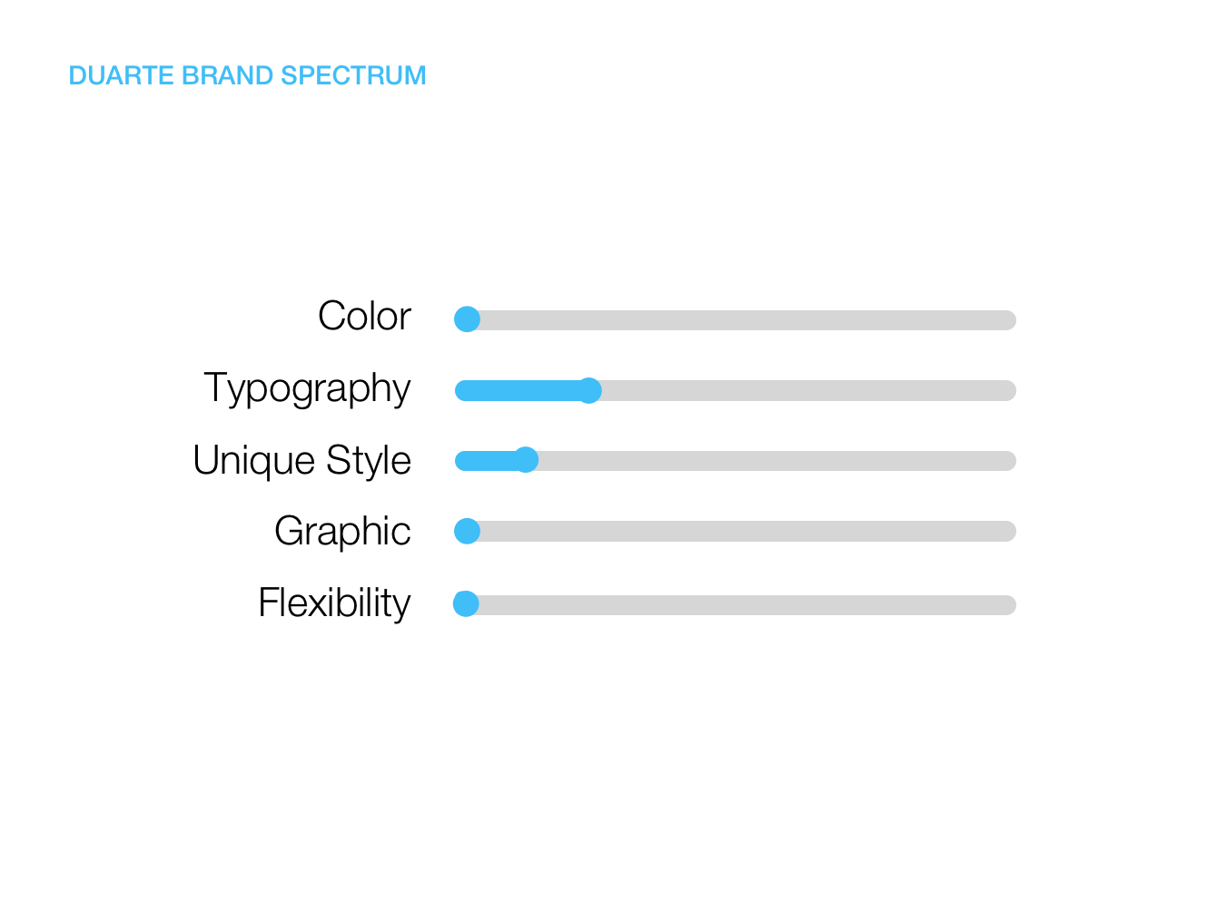
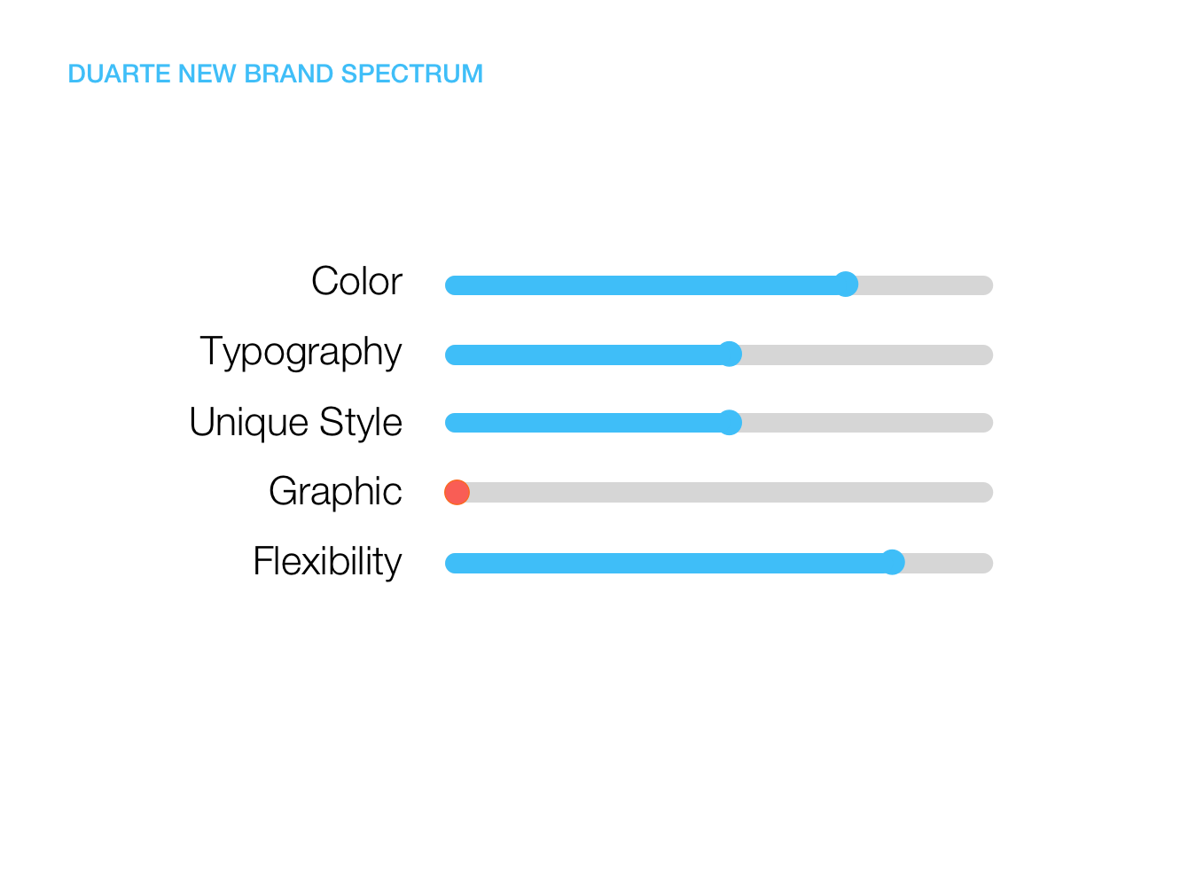
There were several aspects of our branding that we wanted to improve. We wanted something that was more flexible with colors and graphics, and we wanted it to have a unique style, persona, and font choices. After doing a quick assessment, we realized our look scored pretty dang low in all five elements we wanted Duarte’s brand to contain: Color, Typography, Unique Style, Graphics, and Flexibility.
If you’re part of this industry, you know that internal design projects are notorious for being put on the back burner to make way for “more important things,” like paying jobs, for example. To avoid the dreaded timeline creep, we planned ahead. We chose a small team of designers and booked their calendars for five days solid, so they could go offsite and focus on building out the new brand.
We created a lab experiment that was truly rewarding in not only the output, but a rejuvenating experience that brought us back to the core of ideation, design, collaboration, critique, creativity, and most of all, friendships. No interruptions, no exceptions – just four people, four computers, one workhorse of a printer, one small room, and lots of paper and tape.
Oh and the schedule was broken up with a weekend in the middle so the team could have a break to rejuvenate and let their ideas marinate. That was clutch.
Once the team got up and running, the ideas (and the music) started flowing.
Note: Never underestimate the power of music in the creative process.
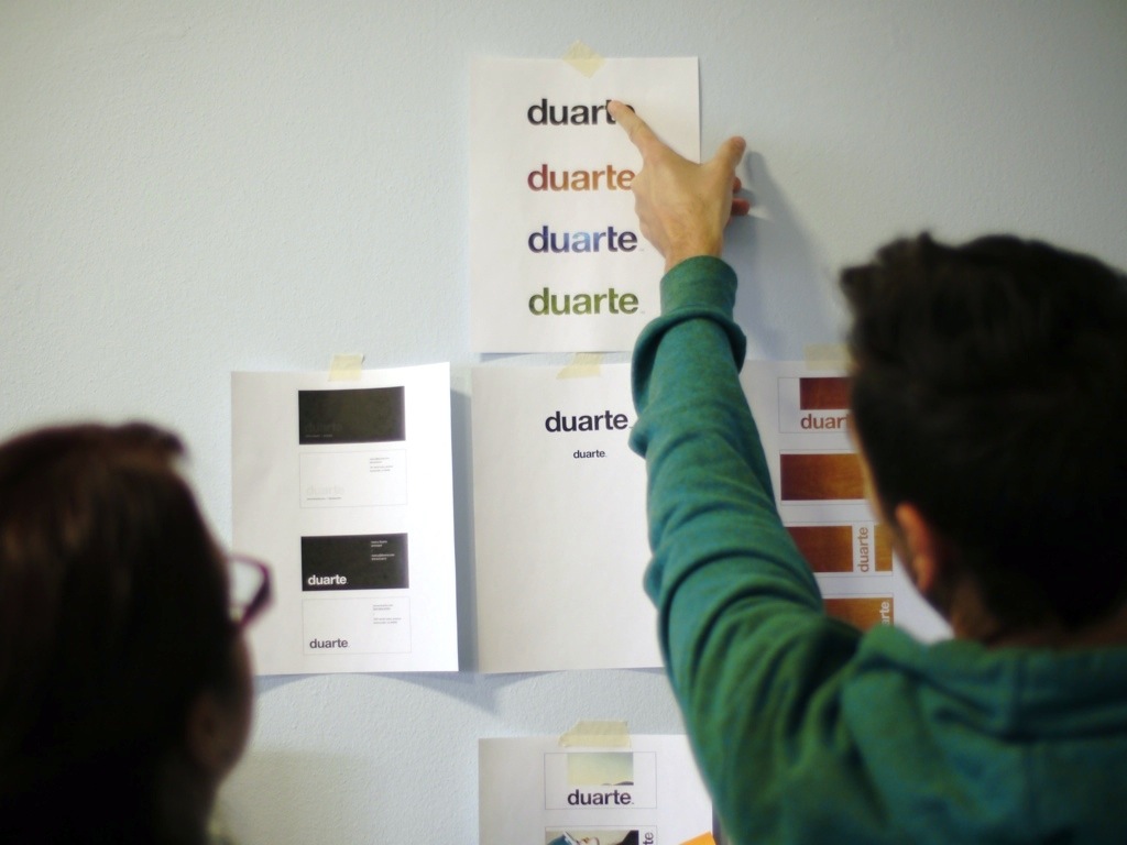
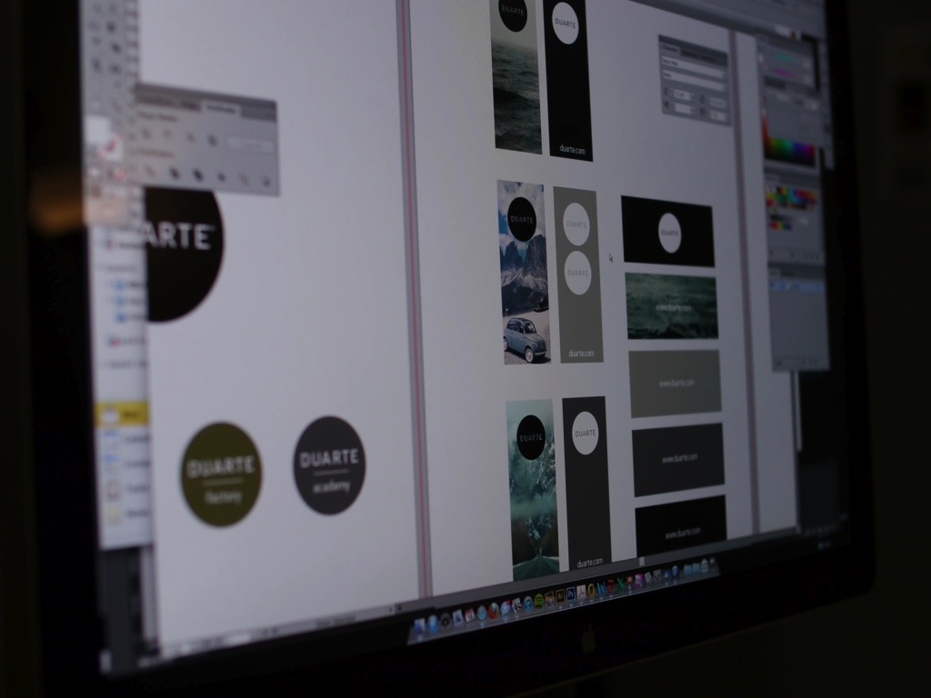
Each person began researching a new element of the brand—colors, shapes, textures, fonts, and photography—and we printed and posted our inspiration on the walls until the room looked like a real life Pinterest board.
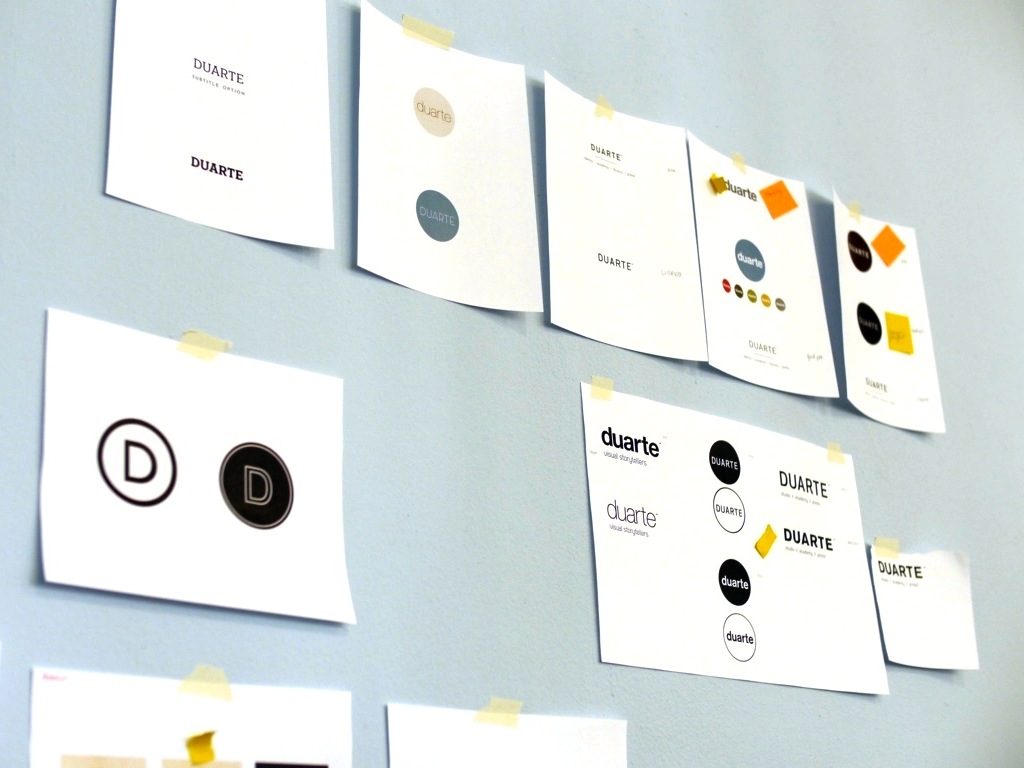
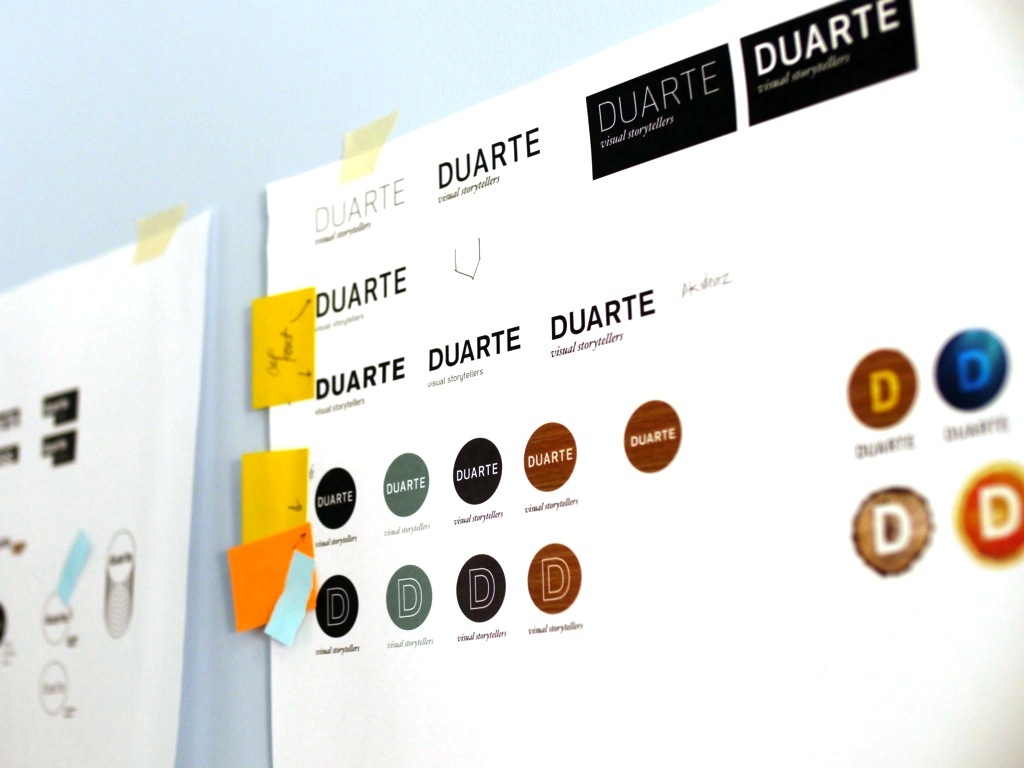
Our exploration started with our original logo, the Circle D. We knew we didn’t want to create a completely new logo because we wanted to take advantage of the brand equity we had established. After exploring many font and texture treatments, we landed on two viable solutions for our identity. Then, the weekend hit.
Note #2: Always take a moment to step away from intense ideation and give your mind a break from the assignment at hand.
Go rock climbing, walk your dog, or the kids, whatever you got. Because when you let your mind reboot, you end up seeing things with a bit more clarity. And you know, the magic happened when we stepped away…when we got back from our two-day hiatus, we all agreed without debate on which option to move forward with. We loved the new logo and were re-energized with new passion to explore other pieces of the brand. We began experimenting digitally with some of our favorite options as possible expressions of the brand, and visualizing how it would interact with colors, photos, and other objects.
Using the same spectrum, we tested the new brand. It passed with flying colors, elegantly combining 4 of the 5 elements we were hoping to include, in our week of ideation, we hadn’t tackled the graphic category yet, so we highlighted it because we knew we wanted to develop that in a later phase.
When it was time to show the new identity to the rest of the company, one of the designers on the team made a quick stop motion video to reveal the transformation of the logo. It added a little suspense, and a little playfulness to the big moment! It was shot and edited in one afternoon, which is evidence of the energy we had in that bubble we were working in. Although a simple transition to the new logo, the new identity is fresh and carries just enough of our brand equity over that it feels like it was part of the system all along.
Our original color palette consisted of three colors: black, white and blue. When revising our colors, we wanted the palette to reflect an air of professionalism, while maintaining simplicity, flexibility, and creativity. The majority of the palette is muted, with a couple of highlights that allow for bold contrast, and playful pops of color.

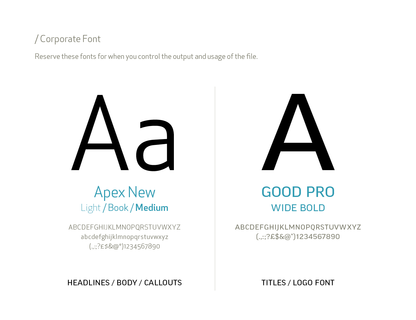
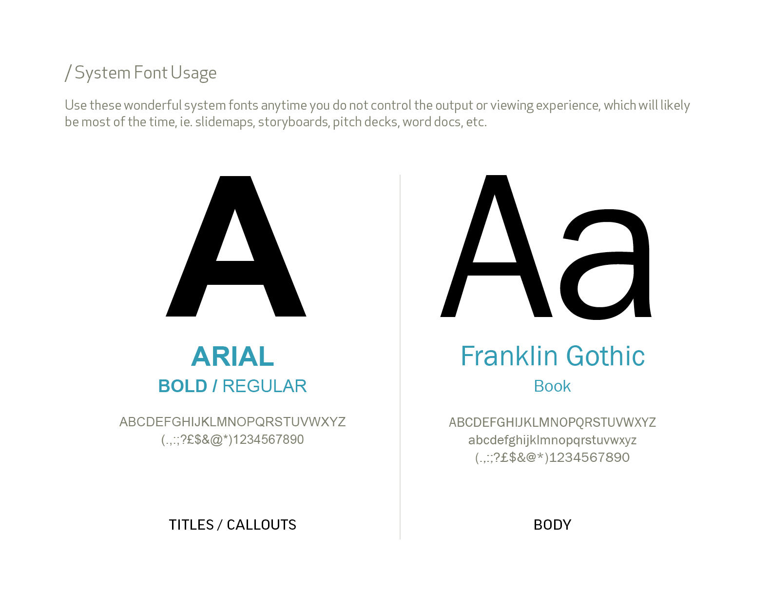
Fonts can be a tricky combination of form and function. There is a trade-off between the beauty of a custom font and the work that comes with installing, managing, and sharing files with our clients. For the brand refresh, we chose Apex and Good Pro Wide as our custom fonts that we would use in collateral, marketing, business systems, corporate presos, etc. We also chose system fonts that would complement our new identity, and eliminate the hassle of fonts not displaying correctly when we send editable documents to our clients.
Once we’d nailed the logo, color palette and fonts, we went a little crazy trying it out on everything. This phase helped us test various use cases, and in the end allowed us to determine what guidelines would be applied to our new brand. We explored designs for our new business system, templates for documents and presentations, infographics, video bumpers, and of course, our new website.
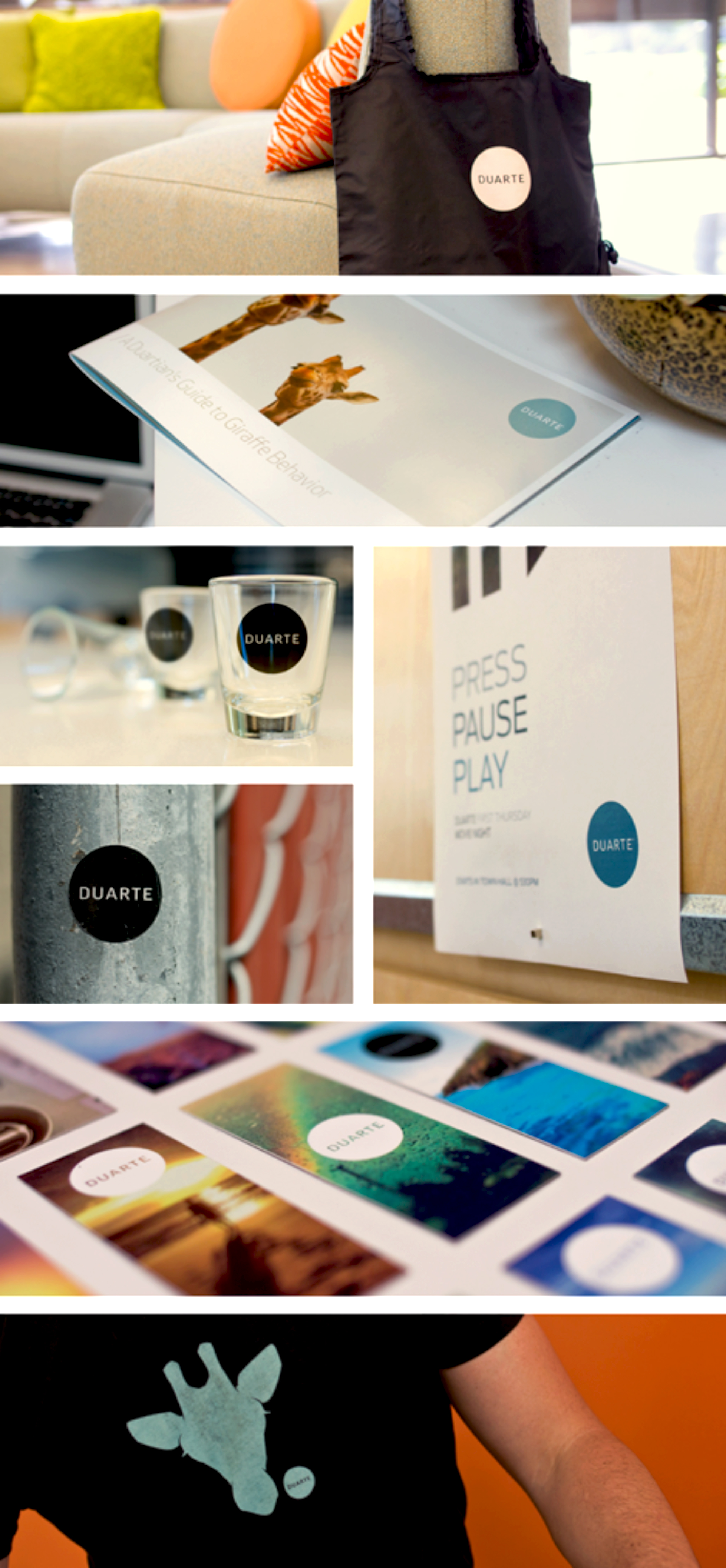
And we couldn’t stop at the corporate elements, we had to think about the Duarte swag! We didn’t just want to slap our logo onto various objects, but we wanted to create things that people would actually want to keep. We put the logo on reusable bags, iPhone cases, shot glasses, posters, and we even had employees submit their Instagram photos to make tiny business cards to spread the word about Duarte. The idea is that each contact card represents a unique person with a different story to tell, but they all feel like Duarte.
We all know how hard it is for an artist or designer to be happy and satisfied with their work. It’s easy for us creatives to slip into the thinking, “It will be better if I keep working on it.” That being said, I am really happy with this logo. It works in many levels. It’s flexible, and professional, yet creative, simple, and it represents who we are, and who we are becoming. The experiment was a success, and we walked away excited for the next era of Duarte.
Written by
Diandra Macias
TOPICS:
Strategy, Visual Thinking
Learn from the pros
Gain insight on effective presentation strategies
From developing presentation skills to designing PowerPoint® presentations, we invite you to join the 200,000 people who leverage our extensive resource library.